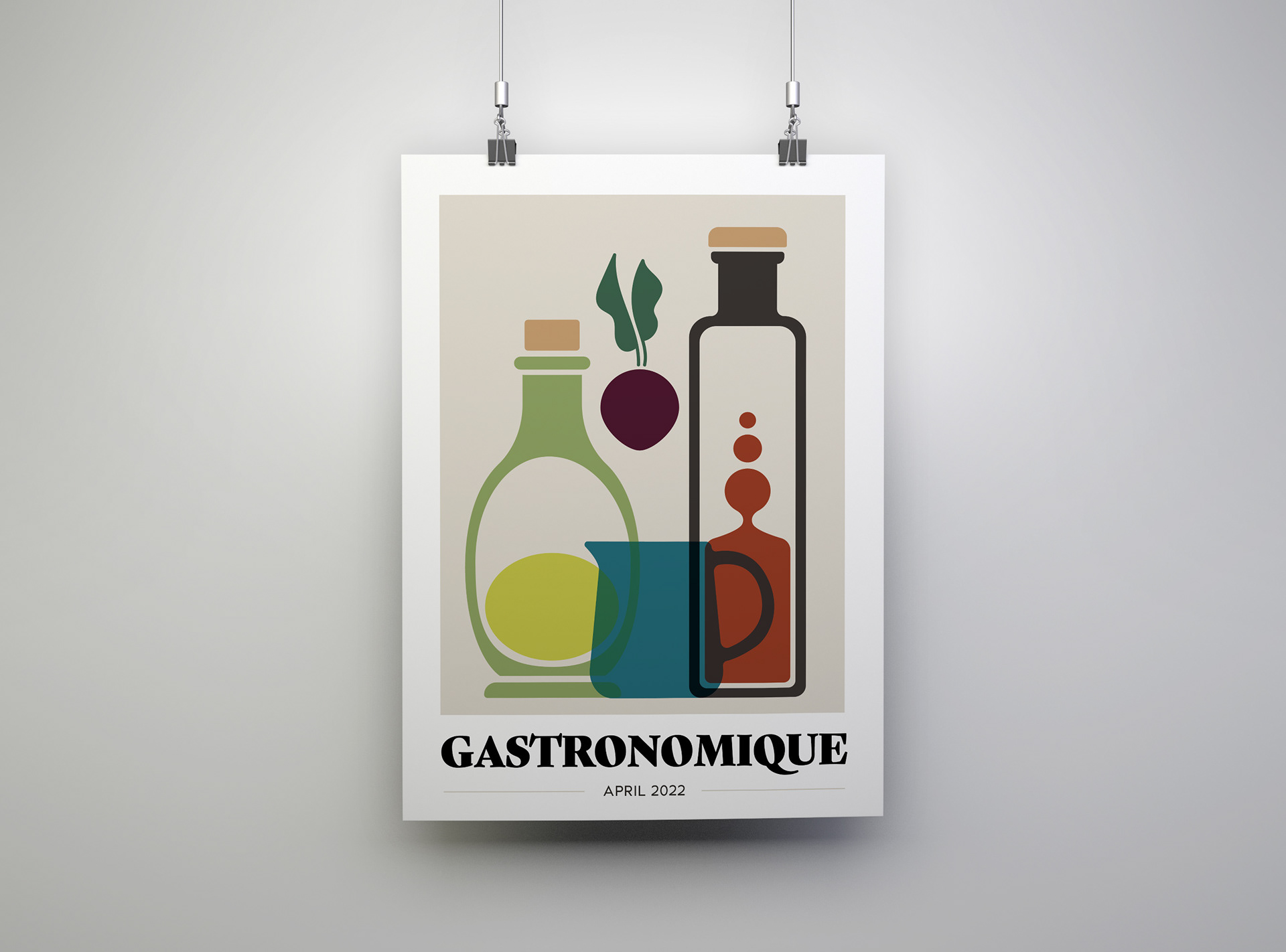
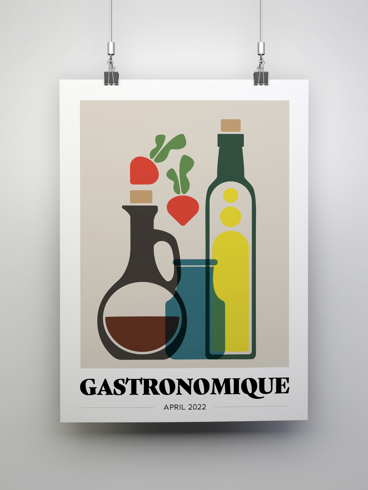
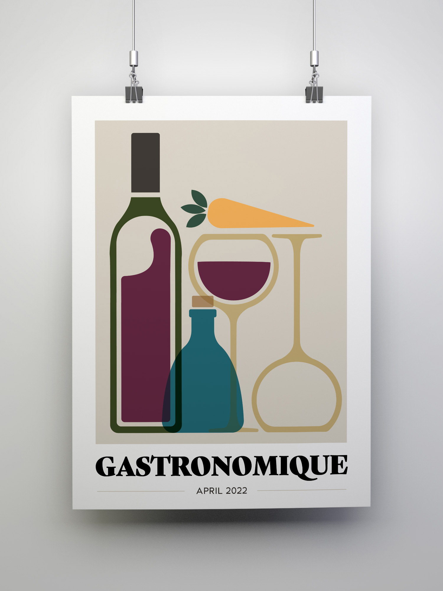
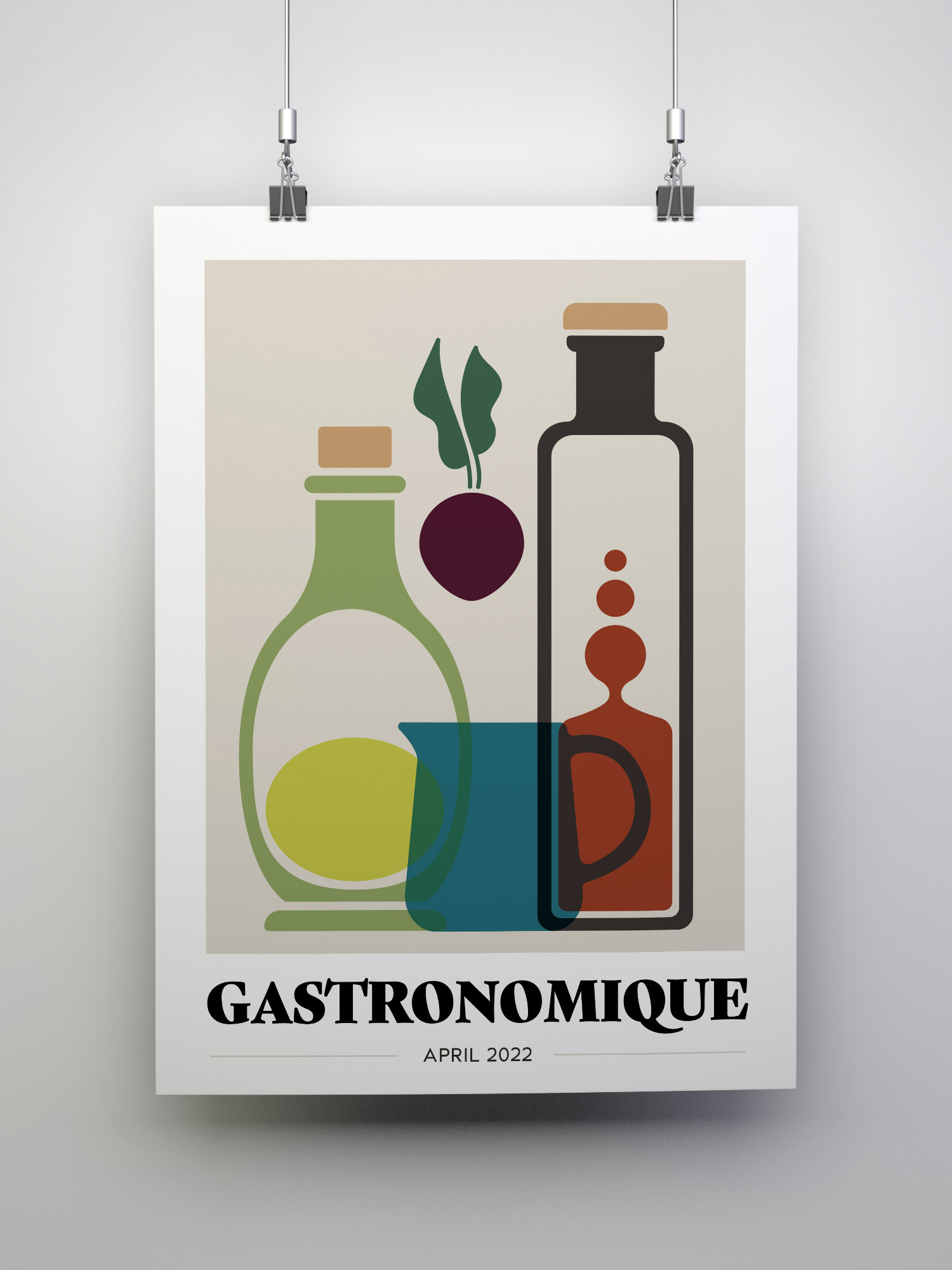
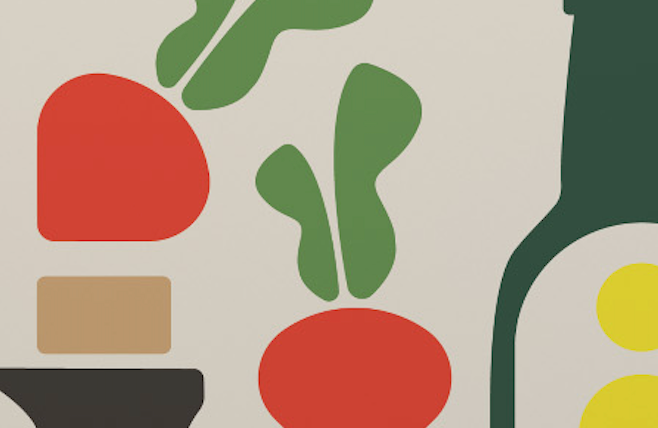
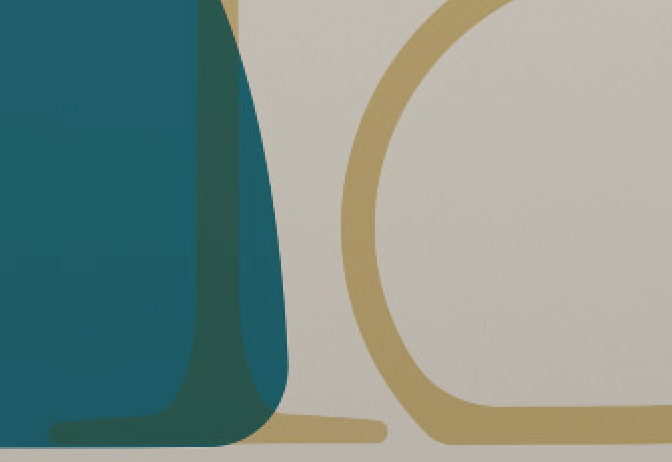
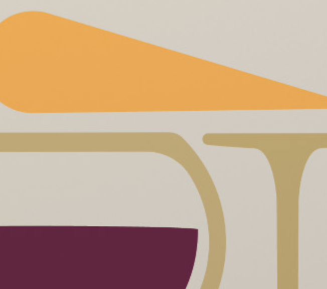
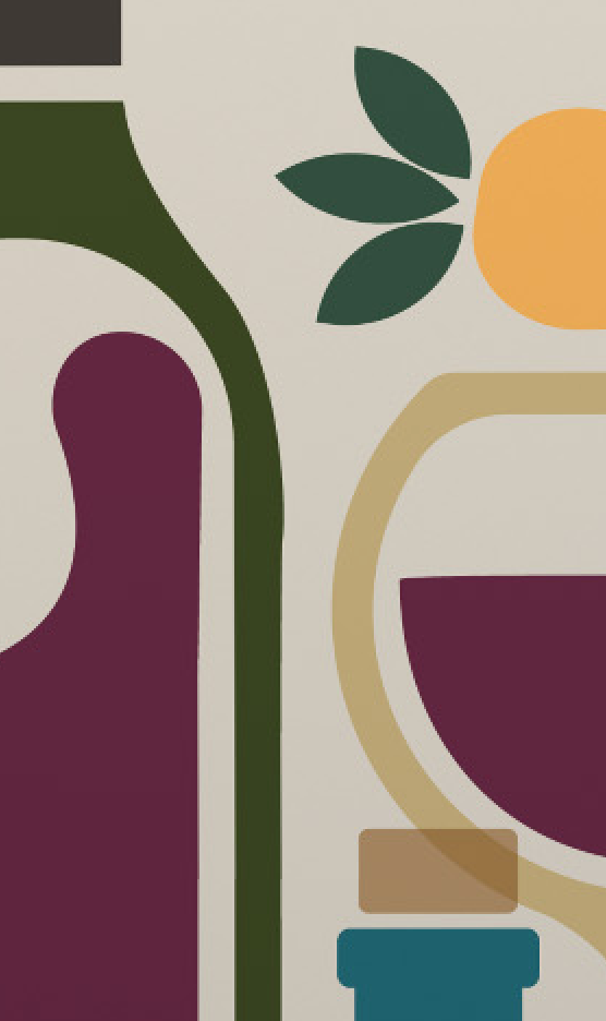
During the first semester of my Master's program at BU, a final project sparked the idea for a series of posters focused on food—specifically the intriguing shapes of wine, oil, and vinegar bottles. Drawing inspiration from vintage food posters, I challenged myself to create three distinct designs that still felt cohesive as a set. This project was another step in my ongoing exploration of the connection between design and culinary arts, blending research and creativity to bring these everyday objects to life.
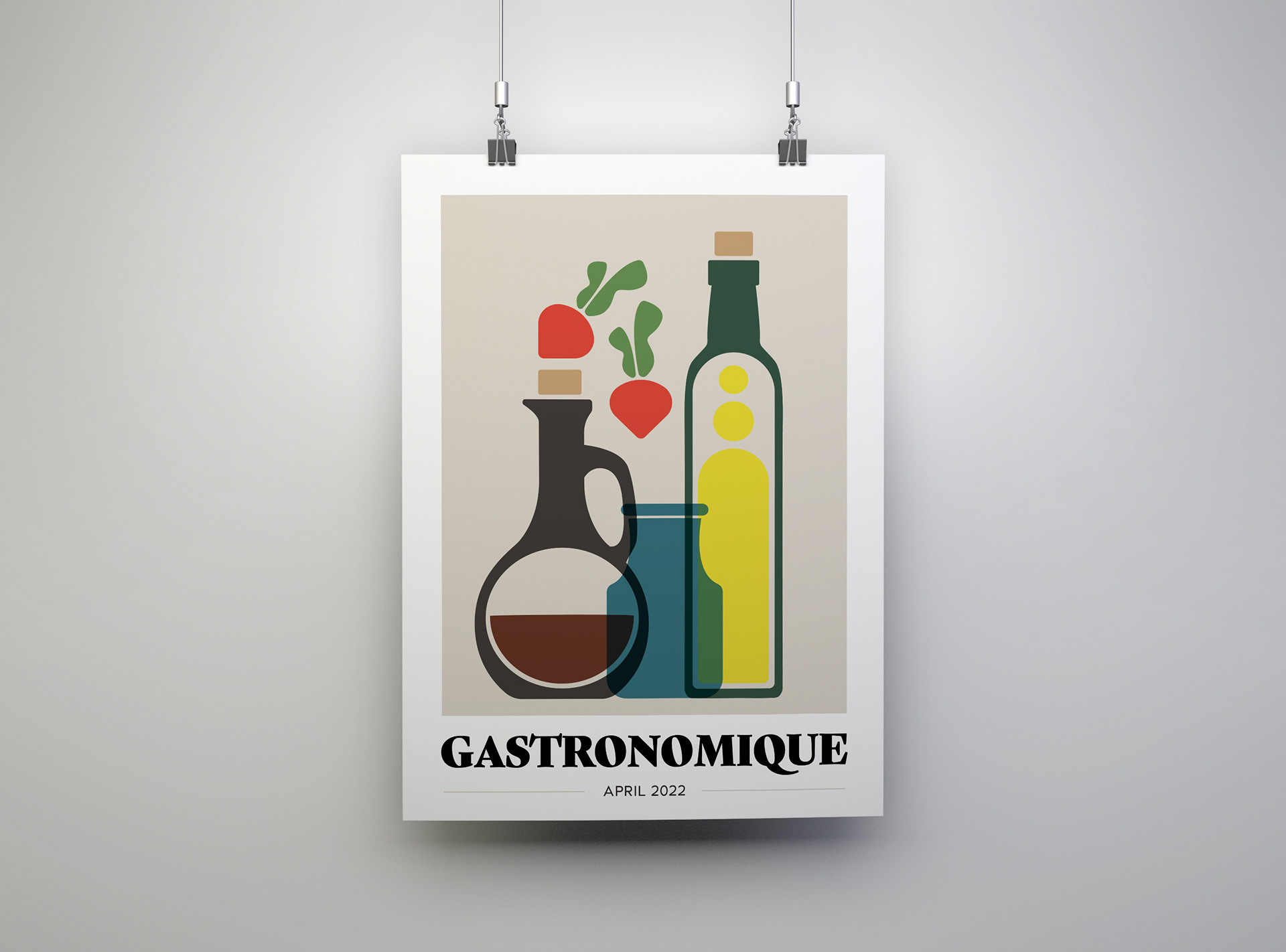
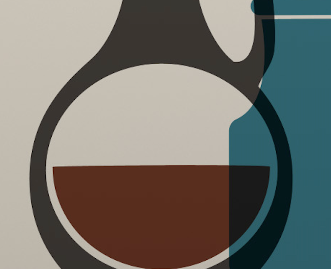

Each poster is unified by a central blue element, but I believe that the true cohesion comes from the thoughtful integration of form and concept across the series. These posters represent more than just a design exercise; they embody my passion for telling the story of food through visual art and my commitment to exploring how design can elevate the culinary experience.


This project also played a crucial role in re-centering me within a design mentality at a time when I was deeply entrenched in academia. The academic environment, while intellectually stimulating, can sometimes distance you from the hands-on, creative work that originally sparked your passion. This series of posters rekindled my love for design, reminding me of why I chose this path in the first place. It was one of the first entirely unguided projects I had undertaken, which made the experience even more meaningful. By navigating this creative journey on my own, without the usual guidance or feedback, I learned to trust my instincts and rely on my skills. This autonomy not only reinvigorated my confidence in my abilities but also taught me how to push myself to grow and improve without the need for external validation or pressure. It was a reaffirmation of my dedication to both my craft and my ongoing exploration of the intersection between design and culinary arts.