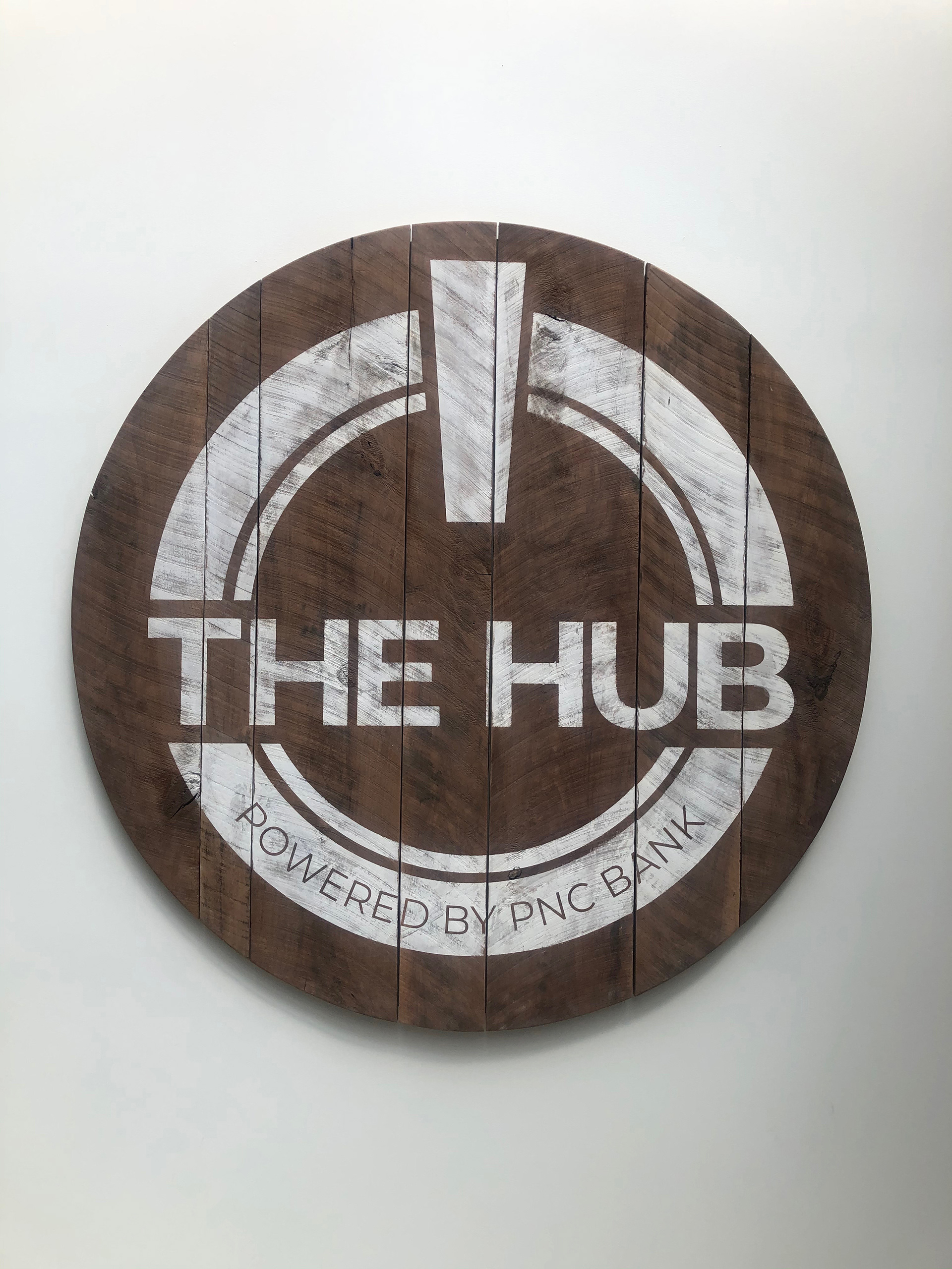
THE HUB
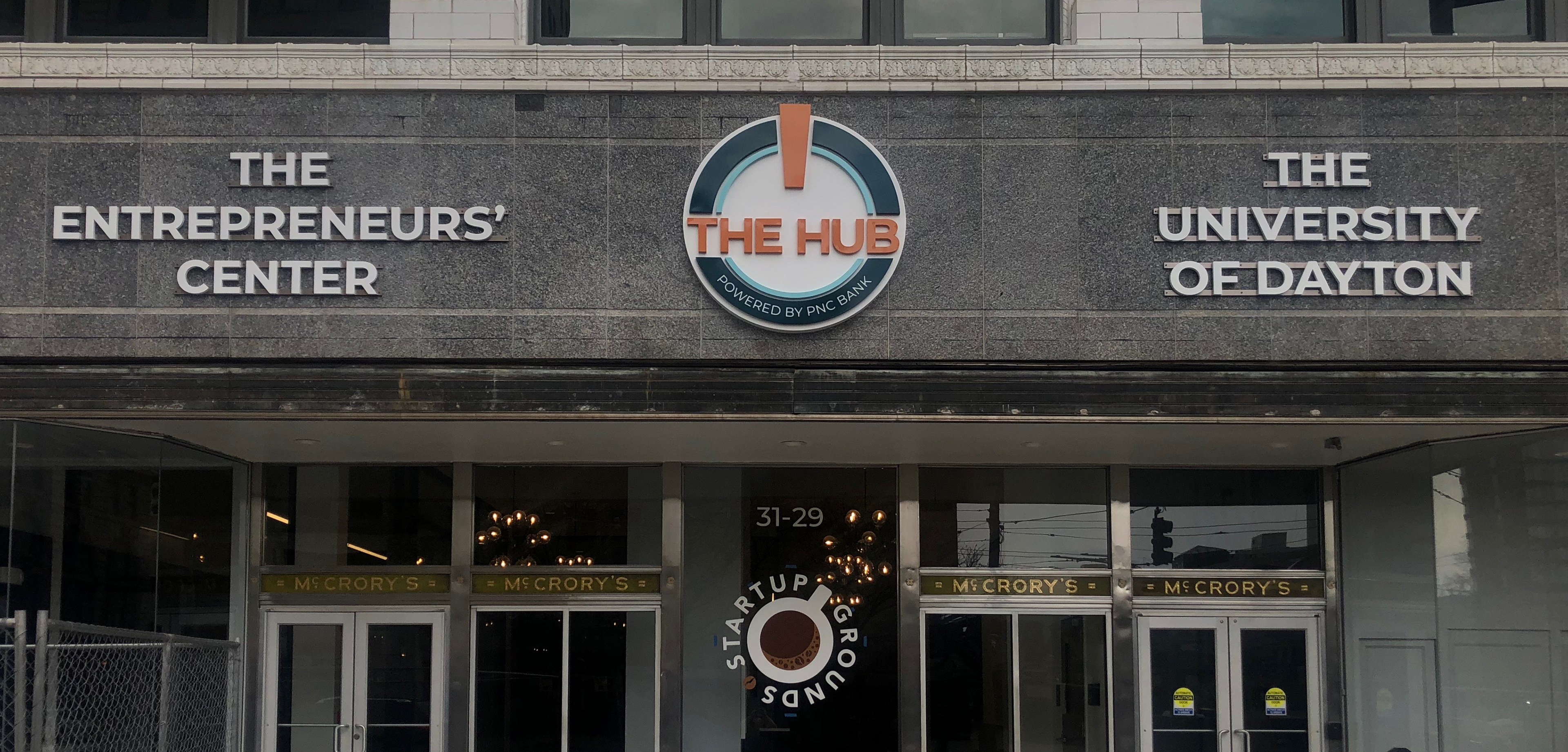
The Hub, a vibrant innovation center and co-share space at the heart of the newly renovated Dayton Arcade, was born from a partnership between the University of Dayton and The Entrepreneur’s Center. The logo I designed captures the essence of this historic space by drawing inspiration from the iconic rotunda and archways, incorporating a color palette directly pulled from the original ironwork. The design subtly echoes the visual concept of a start button, symbolizing The Hub as a place where history meets new beginnings, supporting local entrepreneurs and University of Dayton students as they embark on their journeys.
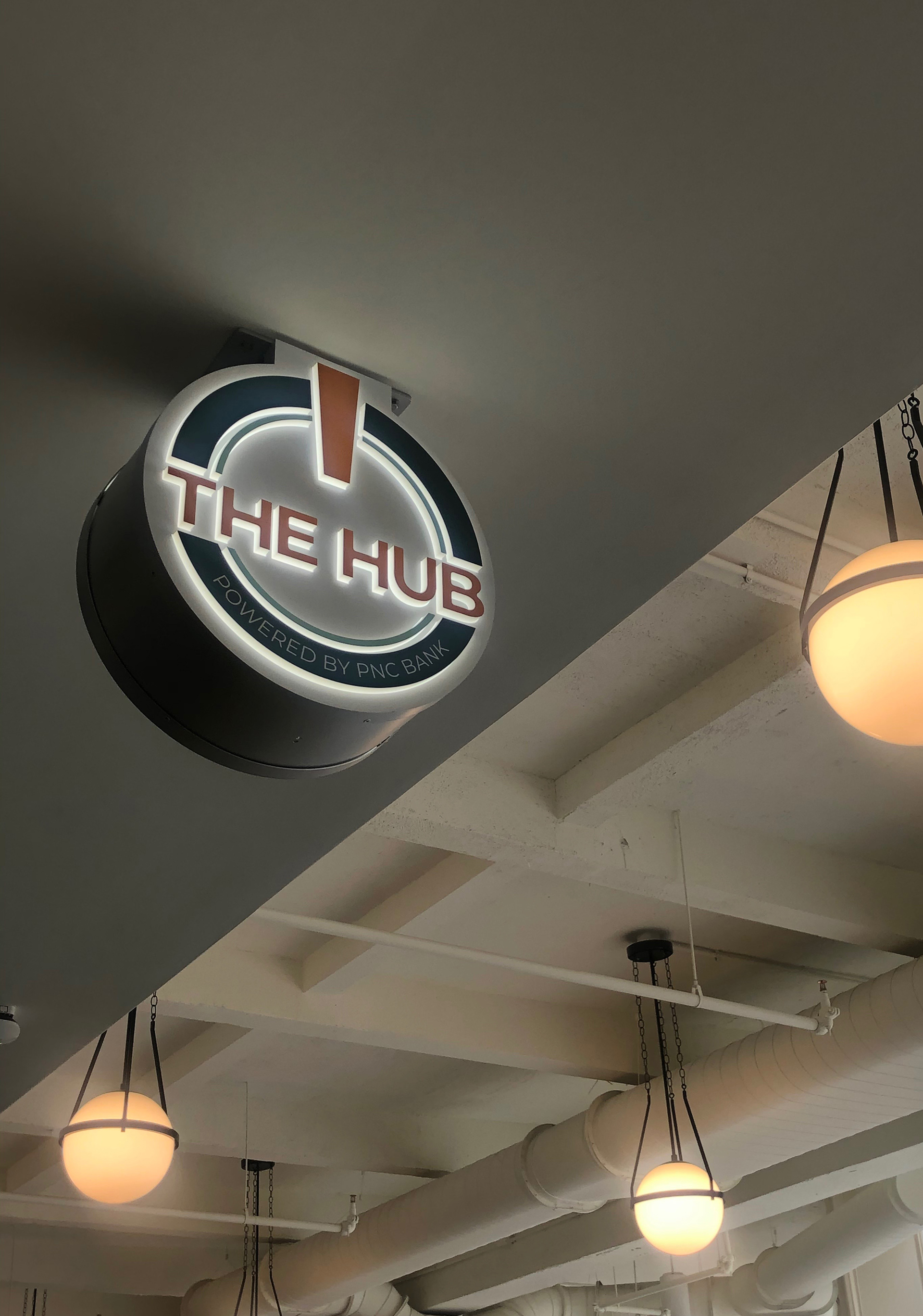
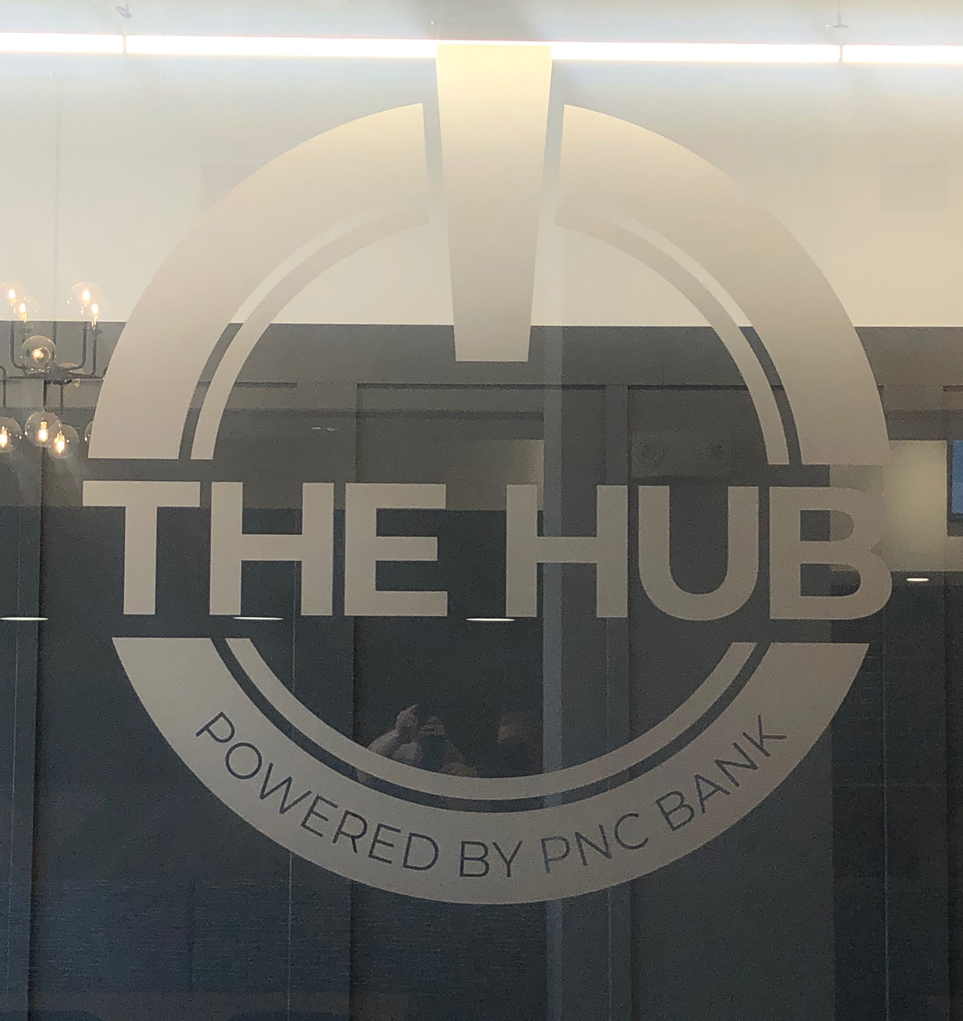
Logo in Rotunda
Logo in Stairwell
Logo in Coffee Shop
This project exemplifies my expertise in brand creation by blending historical significance with modern design principles. Designing The Hub's logo was not only a chance to create a visual identity for a dynamic and forward-thinking space but also an opportunity to engage in cross-disciplinary collaboration. Working with partners from both The Entrepreneur’s Center and the University of Dayton, I navigated a rich historical context while integrating contemporary design elements. This experience deepened my understanding of how to bridge diverse perspectives and generations in design, ultimately enhancing my ability to craft branding solutions that resonate across different audiences and contexts.
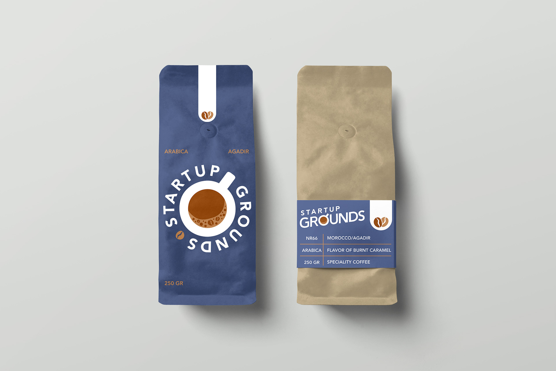
STARTUP GROUNDS
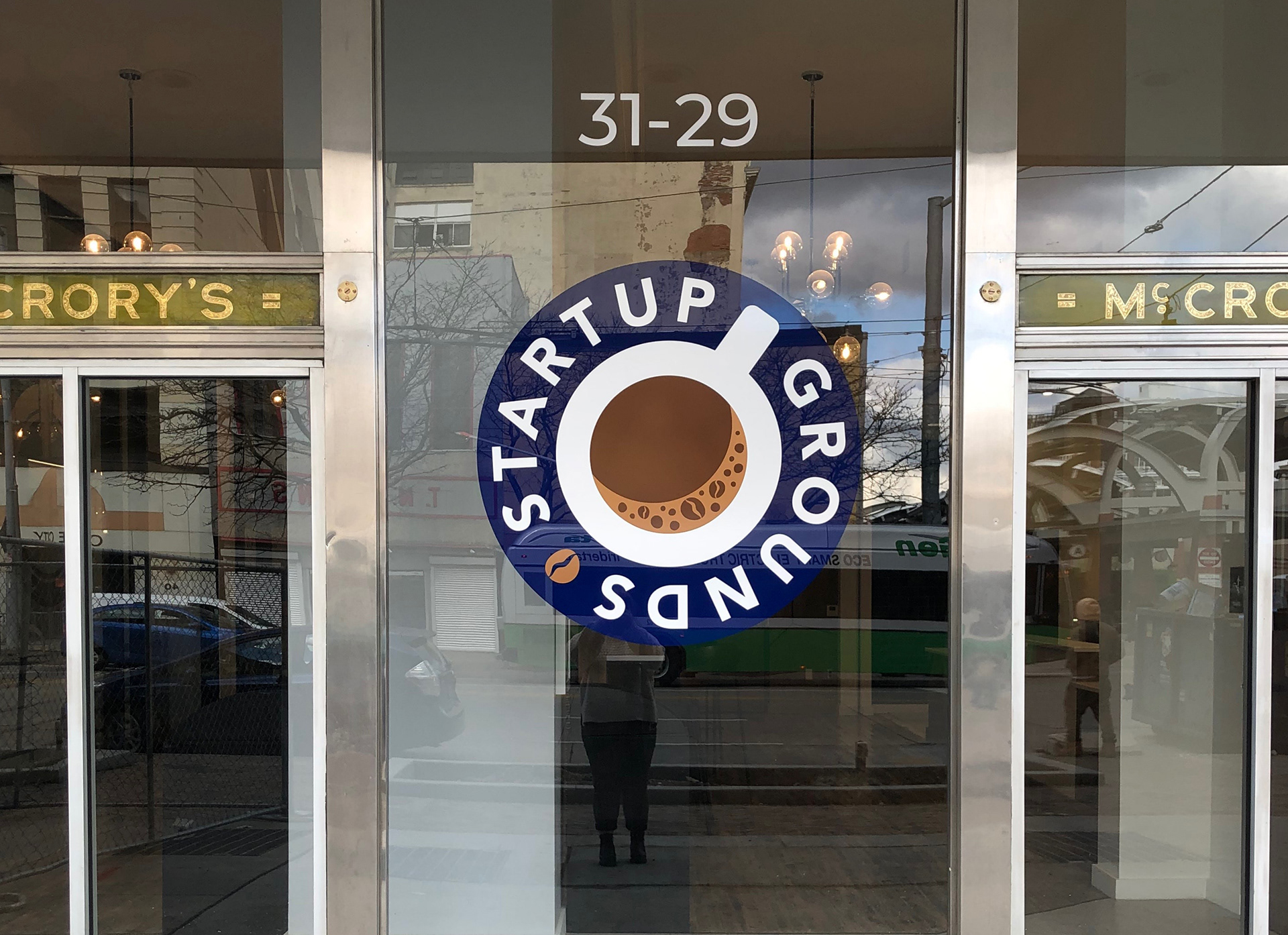
Located just outside The Hub in the historic Dayton Arcade, Startup Grounds serves as more than just a coffee shop—it’s a gathering place for entrepreneurs, students, and community members alike. The brand identity was built around the dual energy of caffeine and innovation. The coffee mug icon, subtly shaped to reference a power button, highlights the “startup” aspect of the name, while its upward tilt evokes momentum, optimism, and a jolt of inspiration—qualities shared by both great coffee and great ideas.
Although the physical space has evolved to meet the shifting needs of students, landlords, and Hub members, the Startup Grounds brand has remained a constant. It continues to represent a sense of place, energy, and connection within an ever-changing environment. This logo was the second of four I created for the Arcade/Hub community—the first being The Hub logo itself—and reflects my ongoing investment in Dayton’s local business and start-up culture. I’m always eager to contribute to this space, where creativity and forward thinking are not just encouraged, but expected.