


The project began with a simple conversation and quickly evolved into a profound exploration of survival and hope.When I first sat down with Dean, the client who had survived being trapped in an underwater cave during a family vacation in St. Croix, he envisioned a book cover that was dark and, in his words, "watery." He wanted to convey the despair and the haunting sense that this cave could have been his final resting place. Yet, as he shared more about his book and the narrative he was crafting, it became clear that there was also a glimmer of hope—a light at the end of the tunnel.
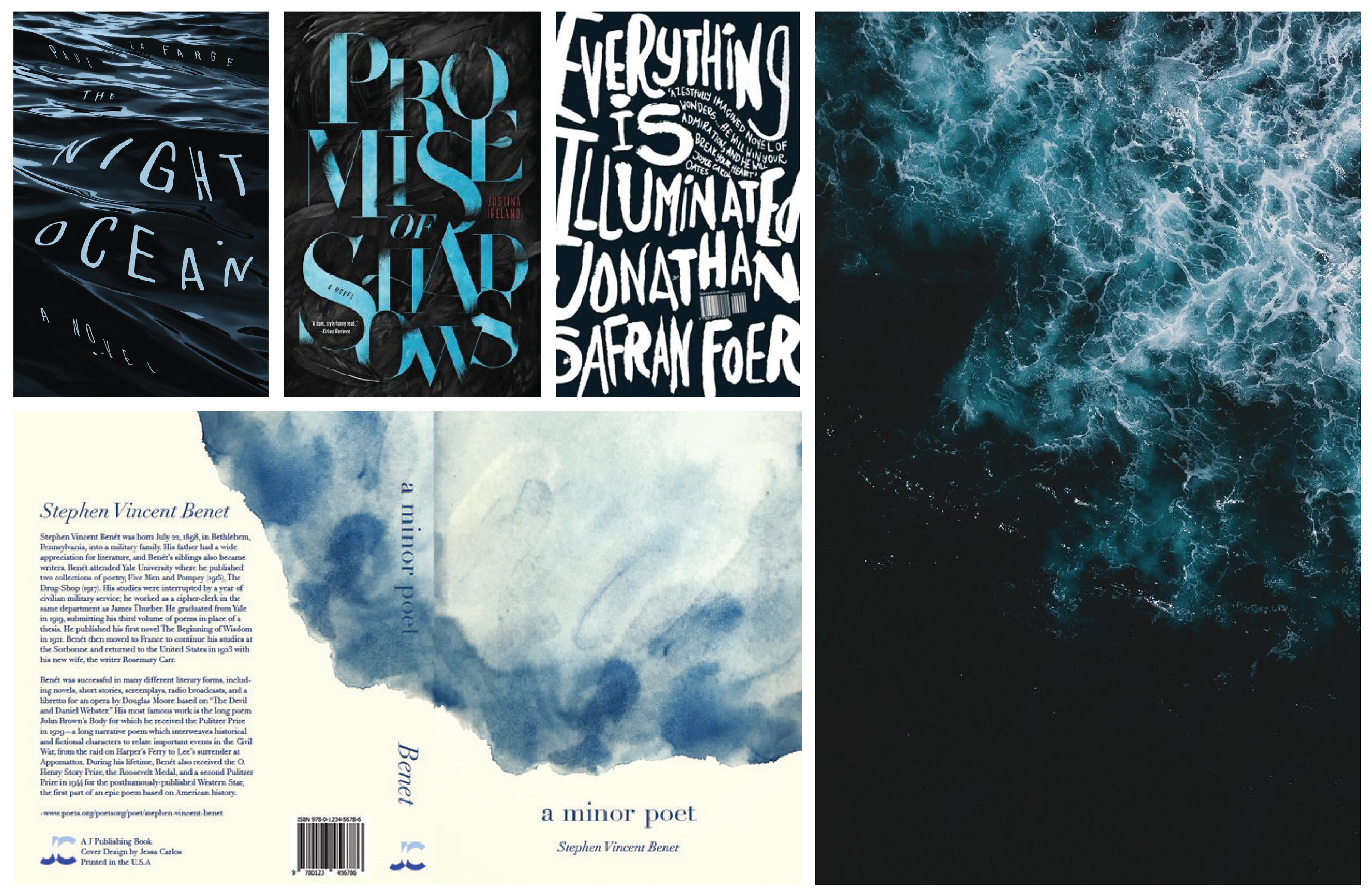
In designing the cover, I focused on capturing this duality through illustration, creating an atmosphere of pervasive darkness with hints of light, symbolizing the delicate balance between despair and hope that defined his story.
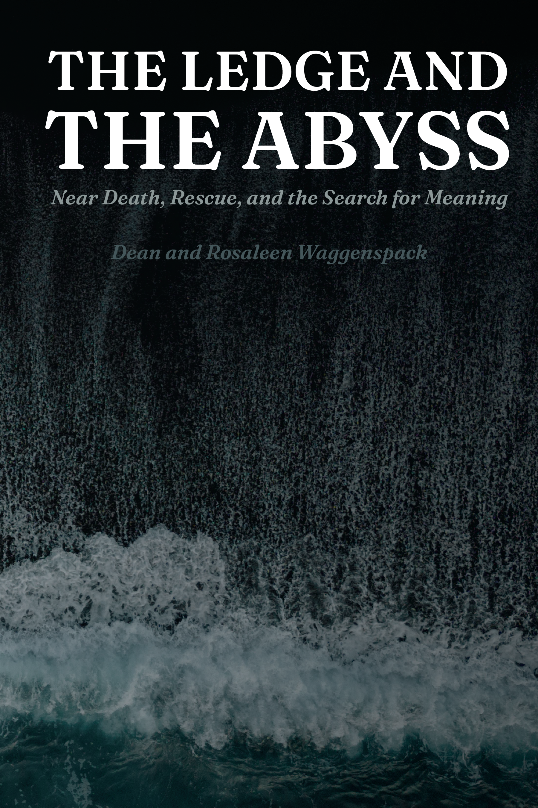
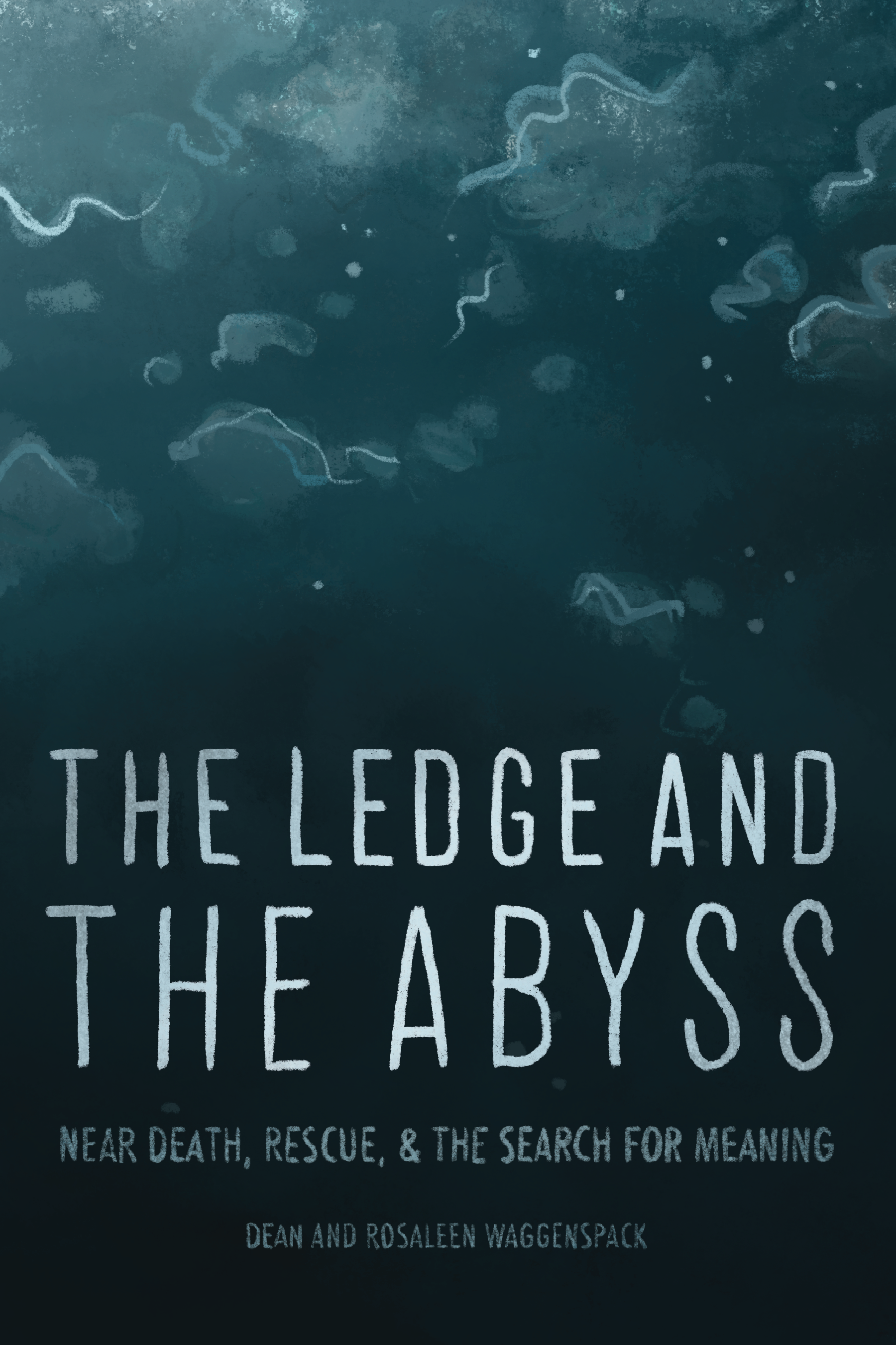
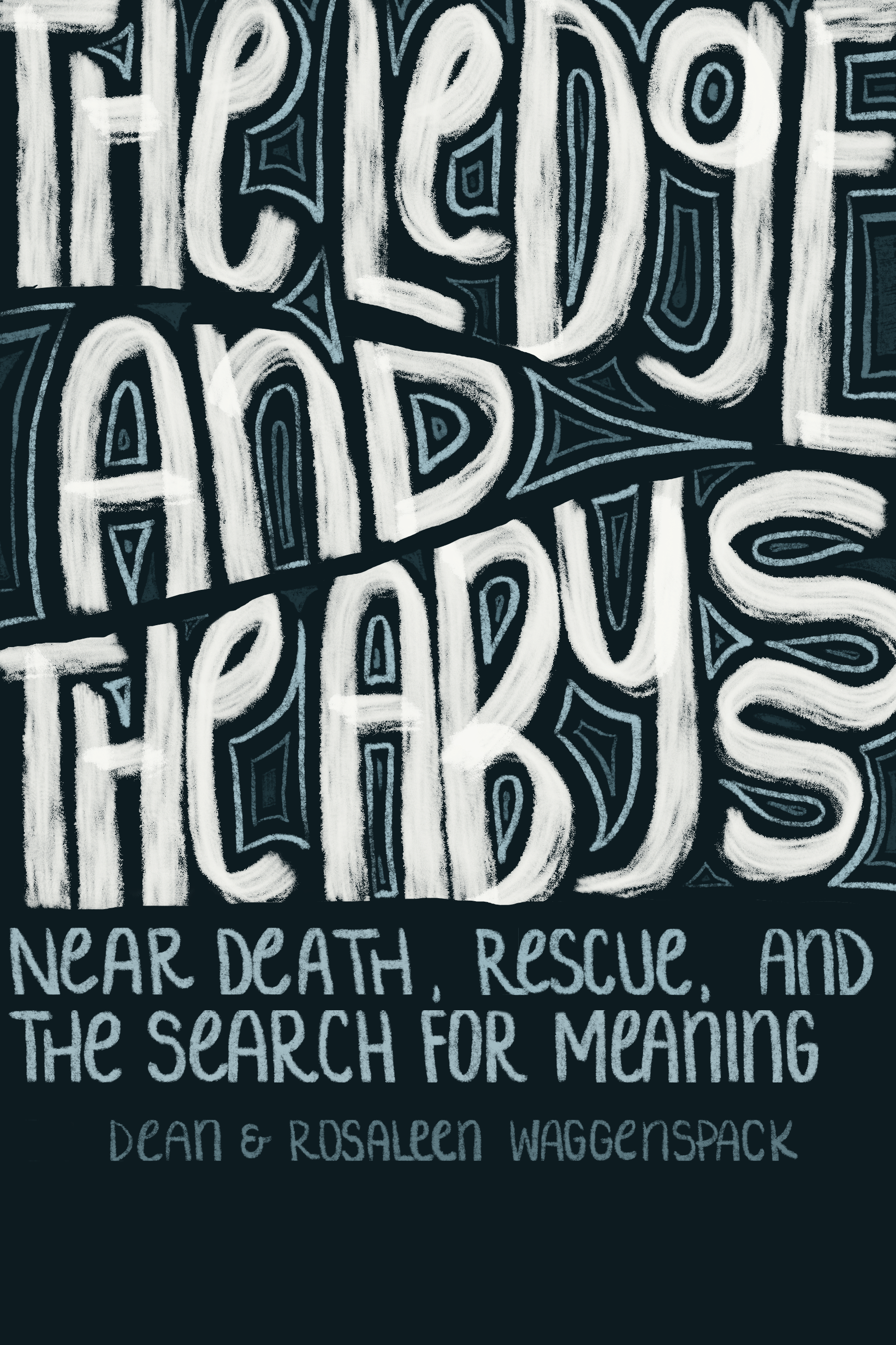
This project is a prime example of my illustration skills and my commitment to truly understanding and interpreting a client’s vision. Through deep conversations with Dean, I was able to grasp the emotional depth and complexity of his experience, translating those insights into a visual narrative that balanced both darkness and hope. This project not only showcases my ability to listen carefully and translate stories into compelling design elements but also demonstrates my dedication to pushing myself to learn new skills, such as illustration, and embrace new technologies. This commitment ensures that I provide the best possible results for my clients, continuously refining my craft to meet their unique needs.

