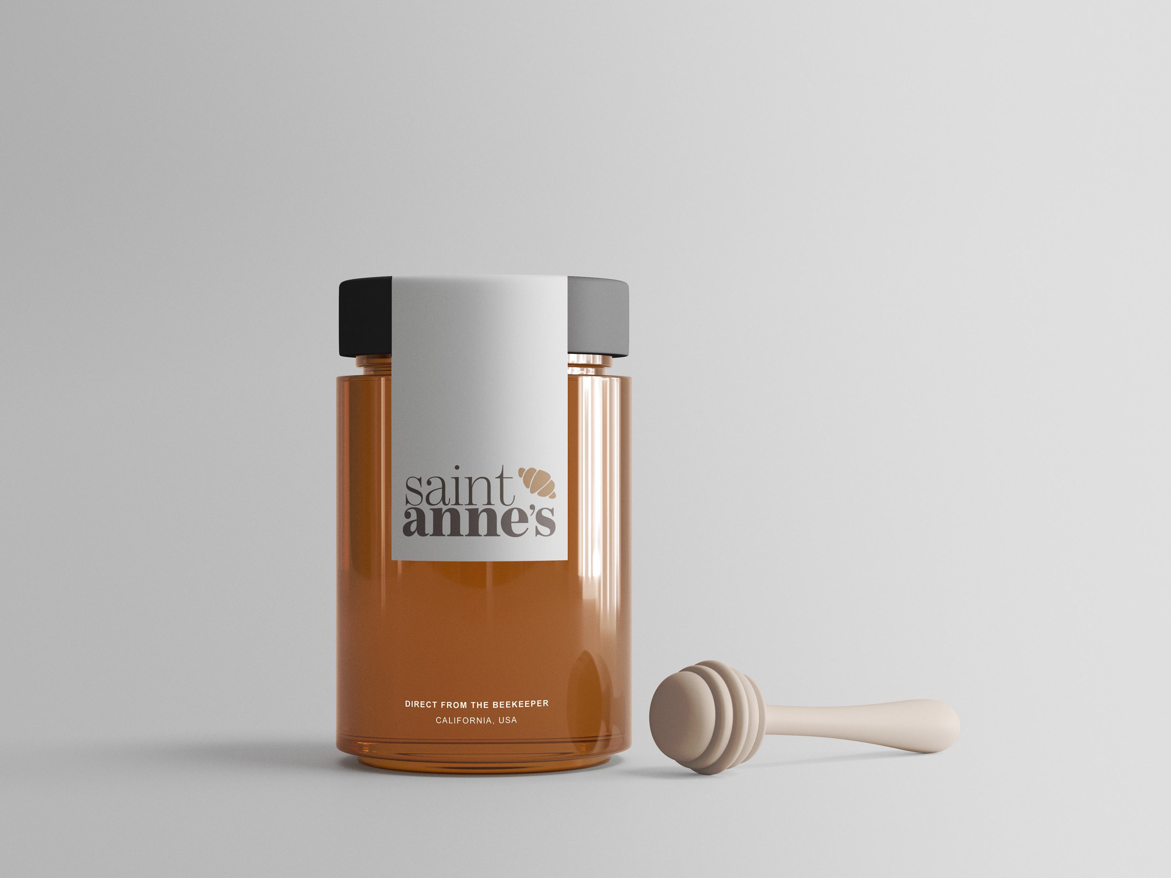
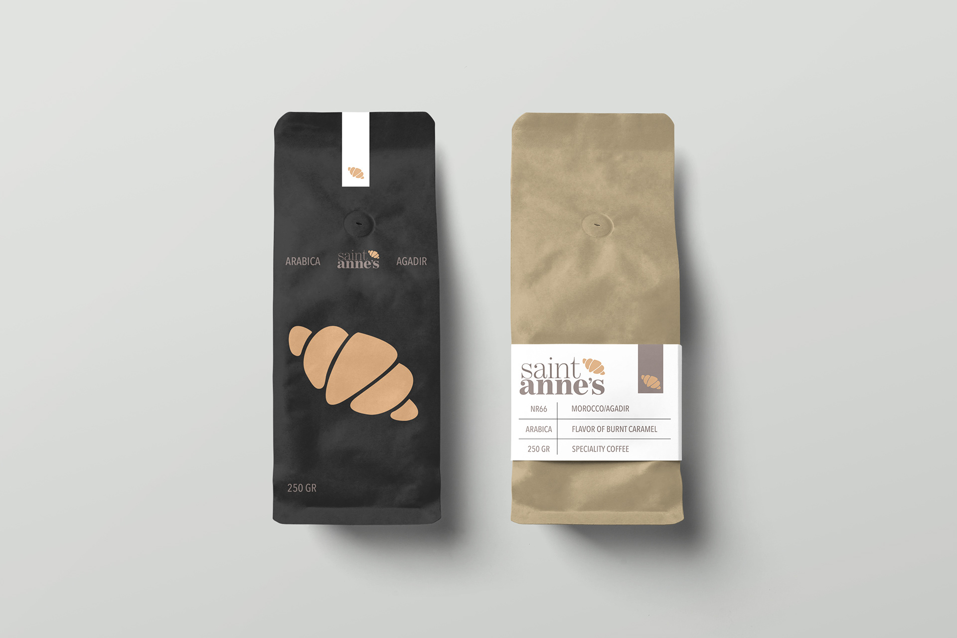
This project is a brand redesign concept for a local coffee shop and bakery nestled in Dayton’s Saint Anne’s Hill Historic District. While the croissant in the mark anchors the brand visually as a bakery, its simplified form allows it to remain clean, memorable, and easily recognizable.
More than just a visual update, this project was part of a broader challenge: to rethink branding through the lens of sustainability. The concept extended beyond logo design into environmentally conscious packaging solutions. My initial vision included a system of reusable coffee containers that could be returned to the shop for either a monetary incentive or discounted refill—an idea that emphasized community participation in sustainable practice. Unfortunately, the project was cut short due to the onset of COVID-19, and the packaging portion never fully came to life.
Still, the visual identity was carefully crafted to reflect the brand’s essence. I wanted the look to feel clean and fresh, without losing the warmth and charm that define independent cafés and bakeries. The hand-drawn croissant retains a local, personal touch, while the refined serif typeface elevates the overall feel—mirroring the elevated care behind their (hypothetical) sustainable approach.