


Cordial & Co. is a hypothetical brand—one my sister and I talk about often, almost like it already exists. Born from our shared love of seasonal flavor and quiet rituals, the idea lives somewhere between daydream and someday. Designing its visual identity gave me the space to explore what it might feel like if it were real.
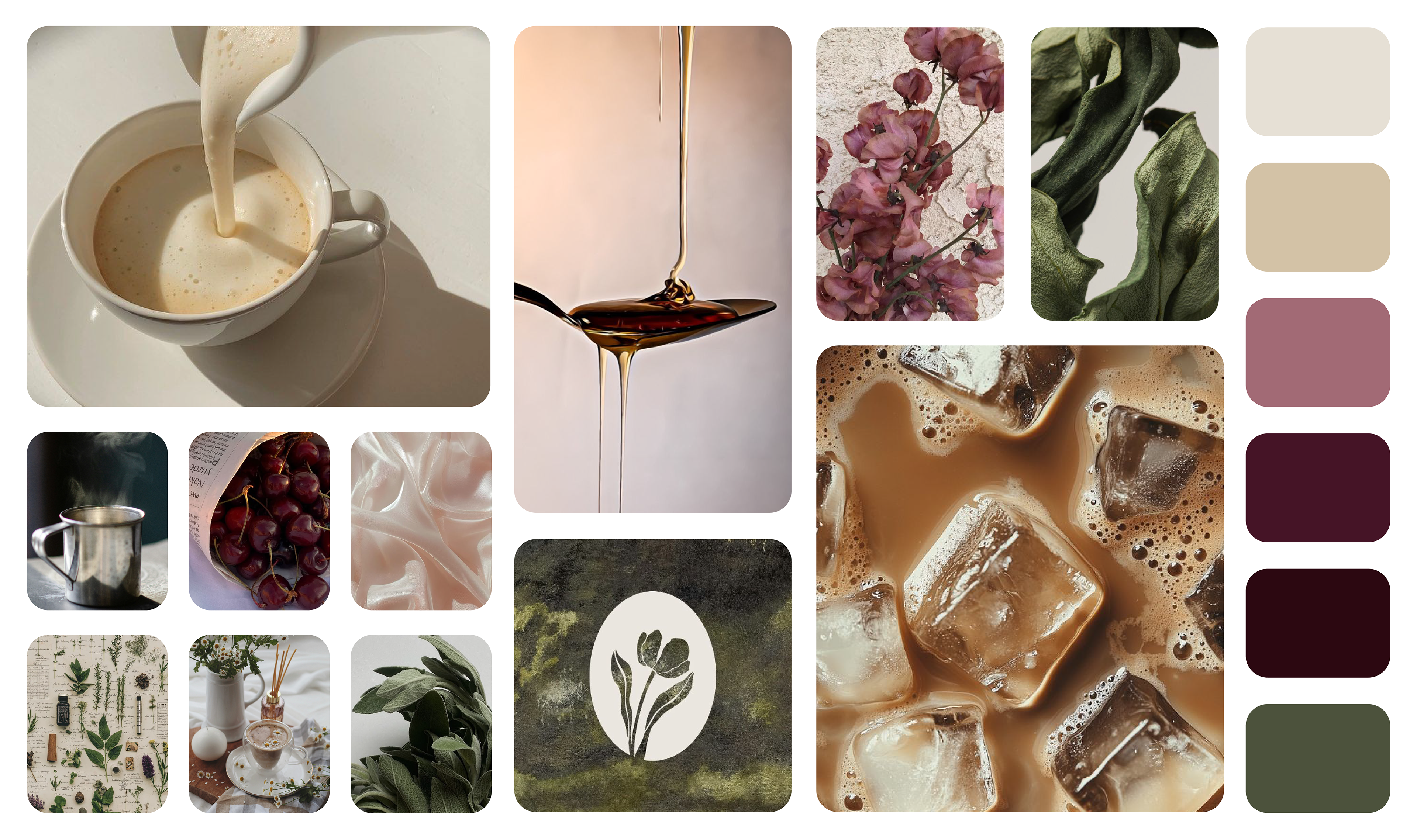
At its core, the brand is warm—but not in the homespun way we usually imagine. Instead, it’s grounded and intentional: a little moody, a little light. The palette blends muted berry tones, dusty pinks, warm herbal greens, and creams—offering balance between brightness and depth.
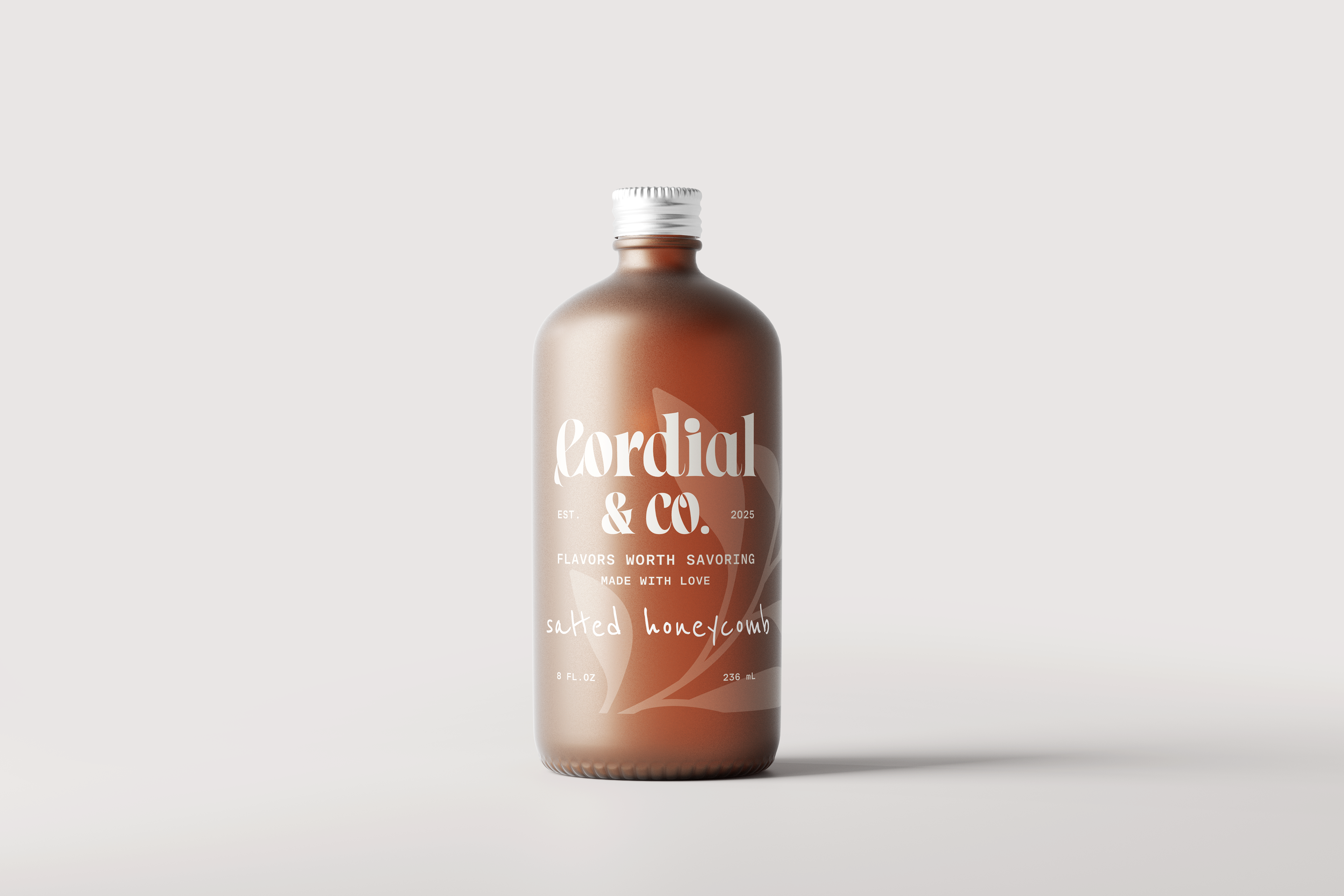
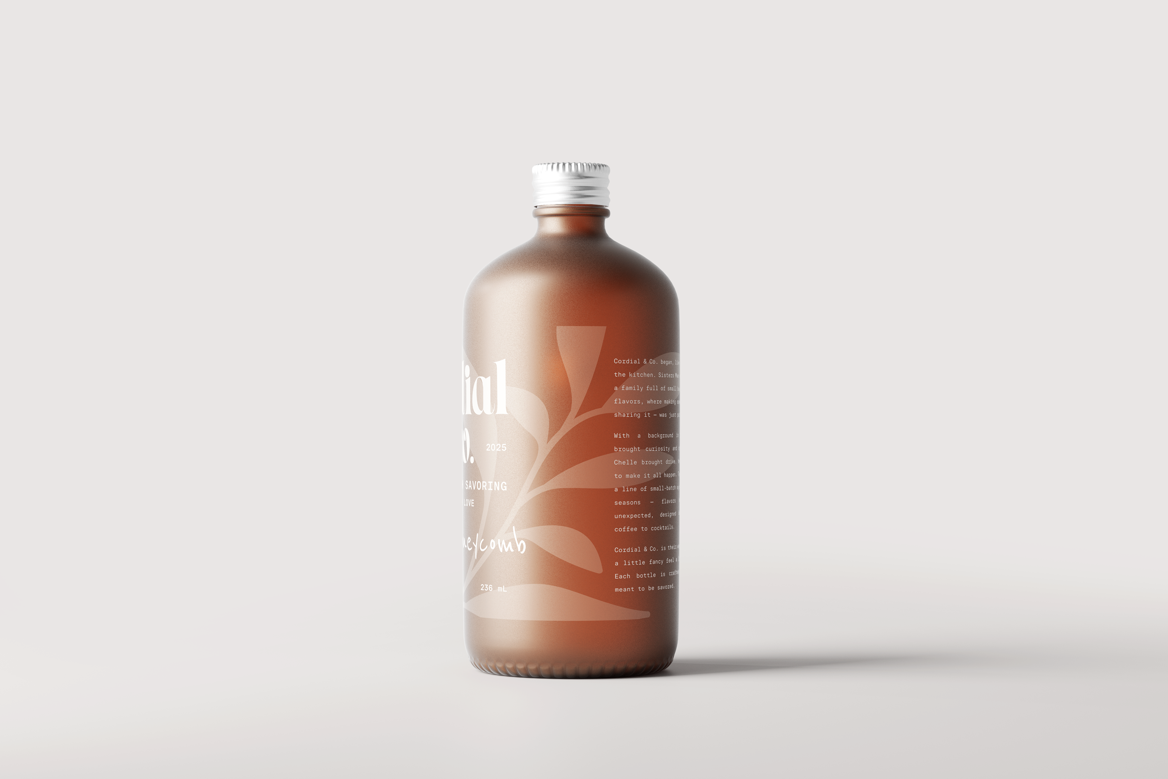
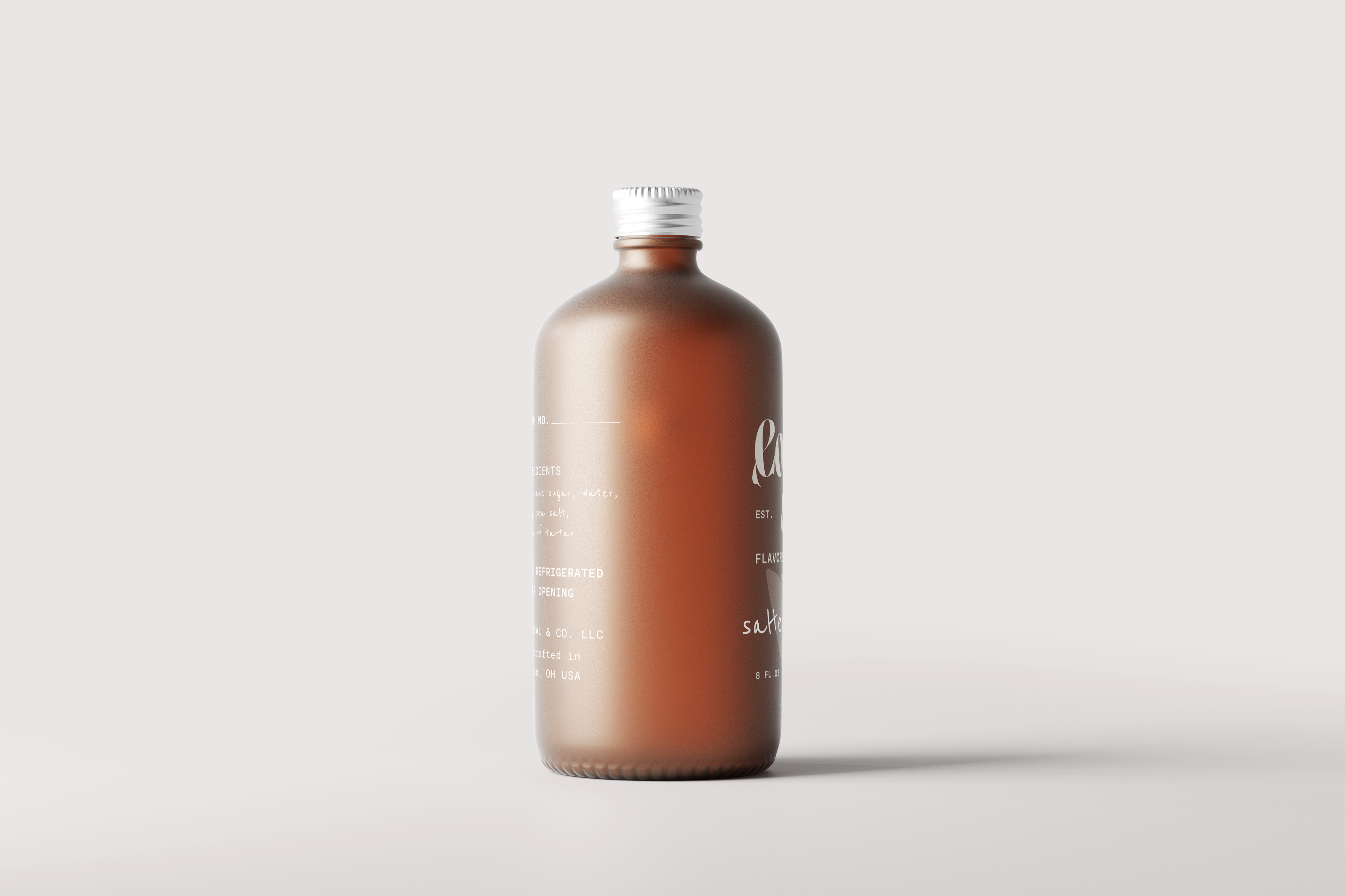
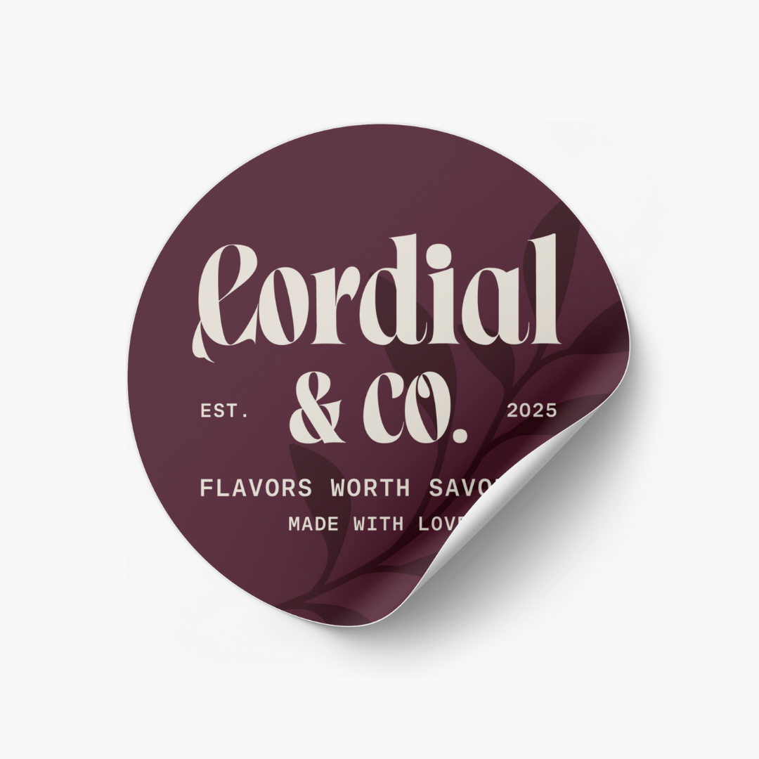
The word-mark features a modern serif with organic flourishes, embodying both elegance and earthiness. The ampersand plays a starring role—a visual thread that speaks to the versatility of the product (coffee & cocktails, sweet & savory) and the two-sister partnership at the brand’s heart.
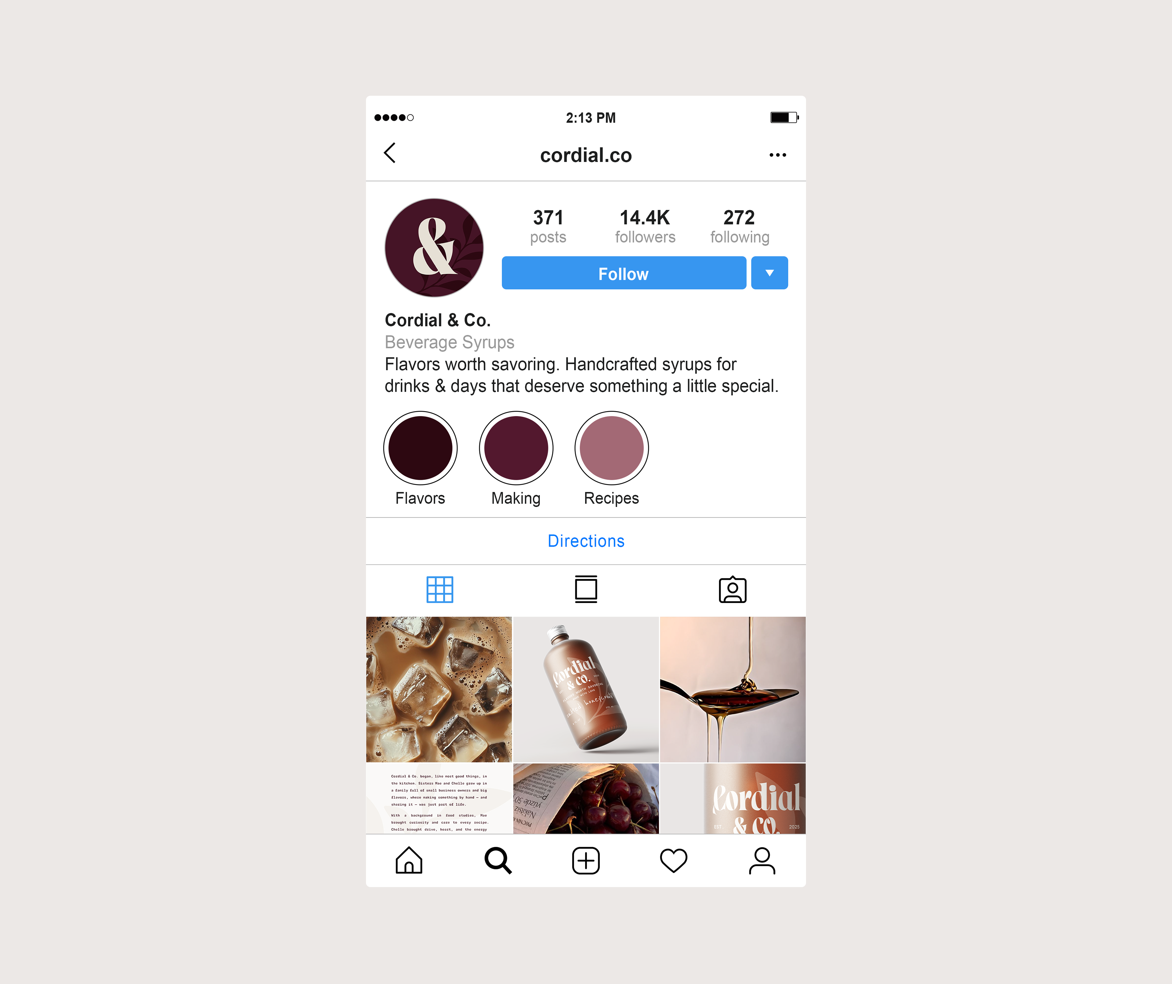
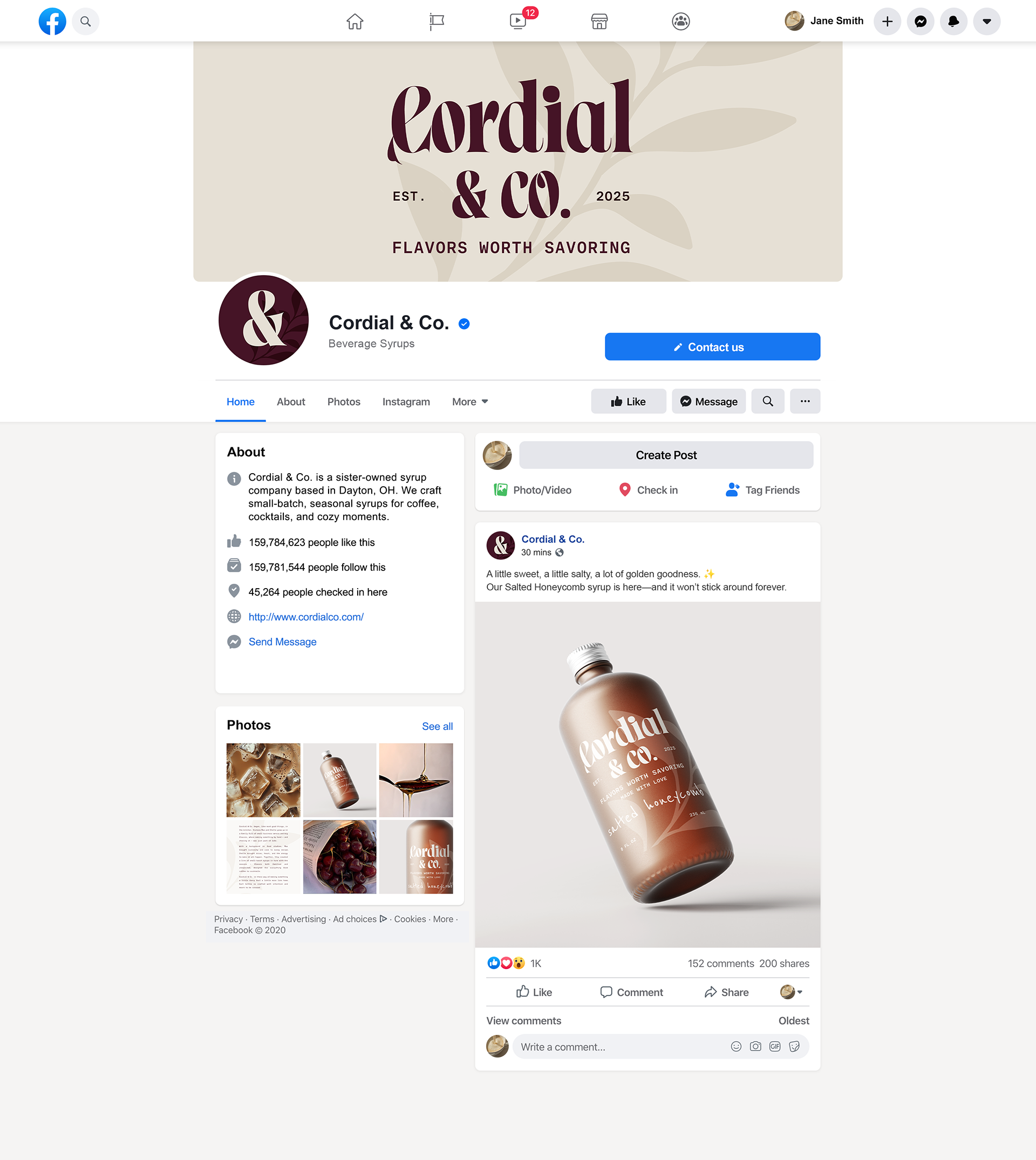
A sage-like sprig is used throughout the system—as a background watermark, a texture, a quiet nod to the brand’s organic, seasonal soul. It shows up on labels, social banners, and stickers, reinforcing a soft, rooted aesthetic.

This project wasn’t just an exercise in branding—it was personal. It asked what it means to design something that feels like home, even if it only exists in the margins (for now).